Stuff about the color orange
- Classic City News

- Sep 7, 2024
- 4 min read

The artist Wassily Kandinsky described orange as “red brought closer to humanity” in his 1912 book, Concerning the Spiritual in Art. While the color has had some famous champions — Vincent Van Gogh made liberal use of it, as did Paul Gauguin — it’s also pretty controversial. For some, it symbolizes joy and happiness, while others find it overwhelming.
Whether you’re pro-orange, anti-orange, or orange-neutral, we see it every day. It’s the color of traffic cones, autumn leaves, the fruit of the same name, and so much more. You know that nothing rhymes with the word (supposedly), but what else do you know about the shade itself? These six facts may deepen your understanding of the hue.
It’s named after the fruit

The word “orange” refers to both a citrus fruit and the color of said fruit, so which usage came first? The color isn’t exclusive to the fruit, of course, but the term did come from it. The first use of “orange” as a color in English dates back to the 15th century, and was derived from pomme d’orenge, the French word for the citrus.
“Orange” started appearing in written English works as a color around the 16th century. Before that, English speakers just described it as “yellow-red.” Renowned 14th-century author Geoffrey Chaucer didn’t even have a singular word to describe a fox in his famous work The Canterbury Tales: “His colour was bitwixe yelow and reed [sic].”
There’s science behind “safety orange”

You probably see safety orange, also known as OSHA orange, hunter orange, or blaze orange, every day on traffic cones, high-visibility clothing, and road signs. The color first started appearing in technical manualsin the 1950s, but it gained some extra scientific rigor in 1959 when the Massachusetts Division of Fisheries and Game, along with the U.S. military, studied it as a color for high-visibility gear.
More than 500 study participants viewed various bright colors under different lighting conditions. Reds tended to disappear under dark lights. Yellow paled to an off-white at certain hours. Orange was the most readily visible to the highest number of people in the majority of lighting conditions — and the least likely to be mistaken for a natural phenomenon, like a tree or an animal.
Most states (starting with Massachusetts) now mandate that hunters wear this color, or sometimes hunter pink, and it’s the standard color for anything you want to be hyper-visible.
Plants get their orange hue from carotene

Bright-orange carrots lend their name to the substance carotene, which gives the vegetable its vibrant hue. While carrots are especially rich in carotene, the substance is found in all sorts of orange plants, like yams — and even plants that aren’t always orange.
Green trees are green because of chlorophyll, a green pigment that helps plants process energy. But when leaves start to die in autumn, the chlorophyll degrades, letting other pigments like carotene and related compounds shine through. It’s also why oranges start out green but turn, well, orange.
The reasons for orange fire

The color of the glow from a fire depends on the temperature of the flame. Red fire is cooler in temperature, followed by orange, and then white, which is why the colors on the edge of a fire change as it hits the air. This applies to all hot things, not just fire — like red lava. But there’s another reason the fire in your hearth or campsite might be a certain color. When wood burns, it releases sodium, which burns orange. If you see little blue streaks, that’s from carbon and hydrogen.
Orange fur as unlikely camouflage

Like people, tigers hunt in orange — they just have less of a choice in the matter. The good news (for them) is that they hunt a lot of colorblind prey, like deer and other ungulates, for whom the tigers actually appear to be the same color as the foliage around them. Their stripes, which dissolve into a woodland background, are uniquely suited to movements like stalking prey. A tiger’s target will sense its movement, but won’t actually clock the outline of a tiger, allowing the hunter to follow its prey undetected.
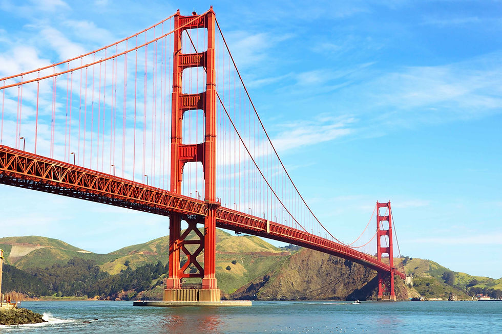
The color of this bridge wasn’t planned

San Francisco’s Golden Gate Bridge, completed in 1937, has a bright earthy tone dubbed “international orange” — but when construction began in 1933, it was on track to be a boring, standard bridge color like black or silver (although the Navy also suggestedyellow and black stripes so that it would be highly visible for ships). Consulting architect Irving Morrow noticed that some of the beams were primed in a reddish-orange color, and made it his personal mission to bring a similar shade to the finished product.
The warm color, he argued, was uniquely suited to San Francisco. It would stand out even on foggy days, and when the sun was out, the hue would pop against the blue sky and water. Such a distinct look would highlight the massive scale and stunning architecture of the bridge.
Morrow made his case to the Department of War, the permitting agency for the bridge, in 1935, and successfully convinced them. Today, the color gets touched up in small segments, since repainting the whole bridge would be a massive undertaking.
Want to replicate the bridge’s tone in your own home? The exact mix is on the bridge’s website.


